
Improving the User Journey
User Journey & UI Design Assessment
Online Ticketing Platform: DICE
This project involved assessing the user interface of the DICE ticketing platform and conducting a competitor benchmark analysis to propose and develop design solutions aimed at improving conversion rates and increasing ticket sales.
(This project is a case study conducted as part of a UX-UI course)
Project Overview
- My role: UX/UI designer
- Project duration: 15 days
- Methodology: Competitor Benchmark Analysis, UI Analysis
- Tools: FigJam, Figma, GoogleMeet
Challenge
DICE platform is experiencing a lower concert sales conversion rates compared to industry benchmarks. There is a significant potential for optimising the UX and tickets purchase conversion through strategic UI improvements.
Project Goal
The goal of this project was to identify and propose design solutions focused on improving the user interface, to optimise the user journey and the ticket sales conversion rates.
BACKGROUND
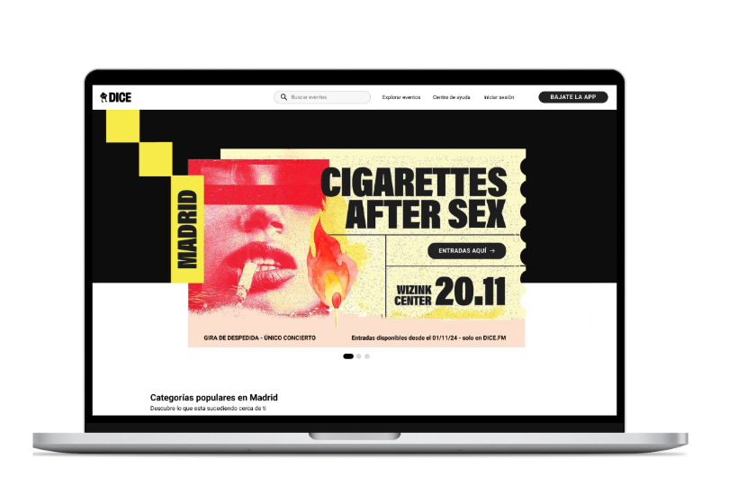
Dice is an online ticketing platform available in Western Europe, the U.S., and occasionally Australia/India. Partnering directly with venues and promoters, Dice offers tickets for different music events, from concerts and parties to mid-size festivals. The usability of the platform is mostly limited by the need for the users to download the Dice app.
The Process
🔍 Assessing and identifying possible pain points in the user buyer journey on DICE website.
🔍 Competitor benchmark analysis compared to the Dice platform.
🔍 Identifying the main pain points in the user journey when purchasing a ticket.
🔍 Propose solutions to improve the user experience on the DICE ticketing platform.
User Interface Assessment
Goal: ASSESS THE USER INTERFACE IN THE TICKET ACQUISITION PROCESS AND IDENTIFY POSSIBLE PAIN POINTS.
- Friction-heavy flows:
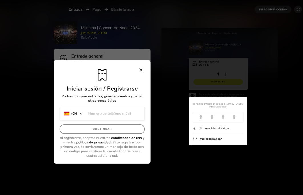
- Mandatory app download for checkout and receiving the tickets.
- Phone-dependent registration (SMS code requirement).
- Abandonment risks: Slow processes when users lack immediate phone access.
- Confusing UI: Search filters resemble buttons, and filtered results lack clarity. The main promoted feature on the homepage is the app, rather than the main product concerts.
✅ The positive aspect of the mandatory app download is that if you have the app, the checkout process is fast, while it adds an extra security layer for the user.
Competitors Benchmark Analysis
The Process
🔍 Identify and analyse key direct and indirect competitors and outline this positive aspects when it comes to content and UI as well as the user buyer journey.
Ticketmaster User Interface
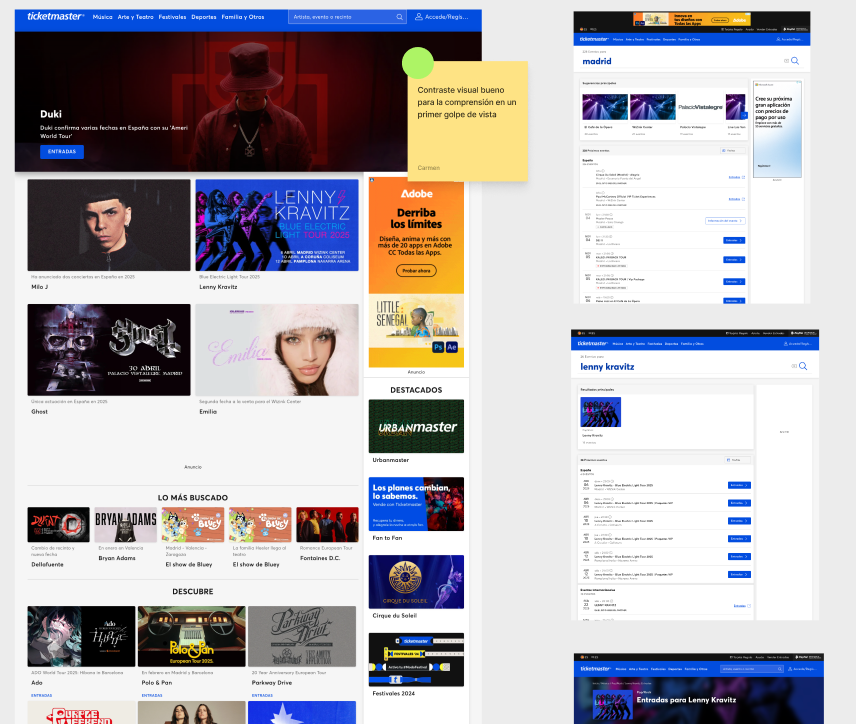
✅ Competitors prominently feature popular events in their hero banners. This approach prioritises specific events, giving them greater visibility.
By doing so, competitors immediately draw users’ attention to concerts or events upon landing on their site. This streamlines the user journey, as visitors can click directly through to a dedicated event page to purchase tickets.
Consequently, this eliminates the need for users to spend additional time searching for specific events, reducing friction in the conversion process.
Ticketea User Interface
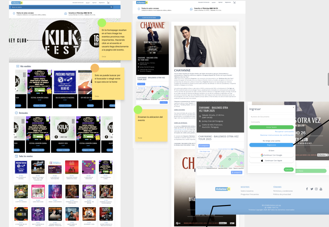
While competitors showcase varied events across their homepage, DICE takes a different approach by prioritising app-download promotions and marketing-focused content.
✅ Competitors maintain notably streamlined user journeys, particularly regarding registration processes. Their systems allow instant account creation through Apple or Google sign-in options, enabling swifter access.
Key Learnings
🔍 Through the competitor analysis multiple elements to improve UI on the DICE platform, such as enhanced event filtering, personalisation and categorisation options, visually specifying the venue location with a map and transport guidance; information about the event duration.
Proposed Design Solutions
Improving the UI & User Journey
The UI design solutions we propose after the analysis involves the following changes:
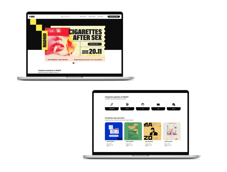
✅ Enhanced visibility for popular concerts: Featuring trending events in hero banners.
✅ Improved category discoverability: Enabling direct exploration of event types (genre/venue/date) from the homepage itself.
✅ Relegated app promotion: The “Download the app” CTA appears smaller in the upper-right corner’s navigation bar, shifting focus to event discovery.
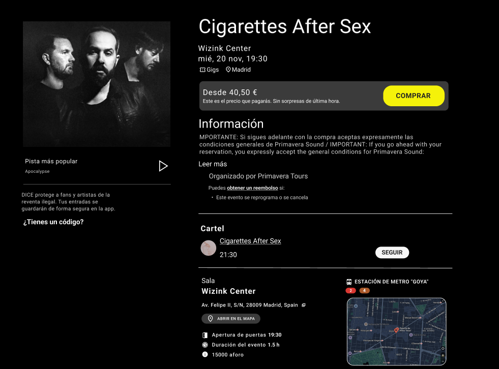
✅ New information elements on the product page: event duration, event location, and transport information.
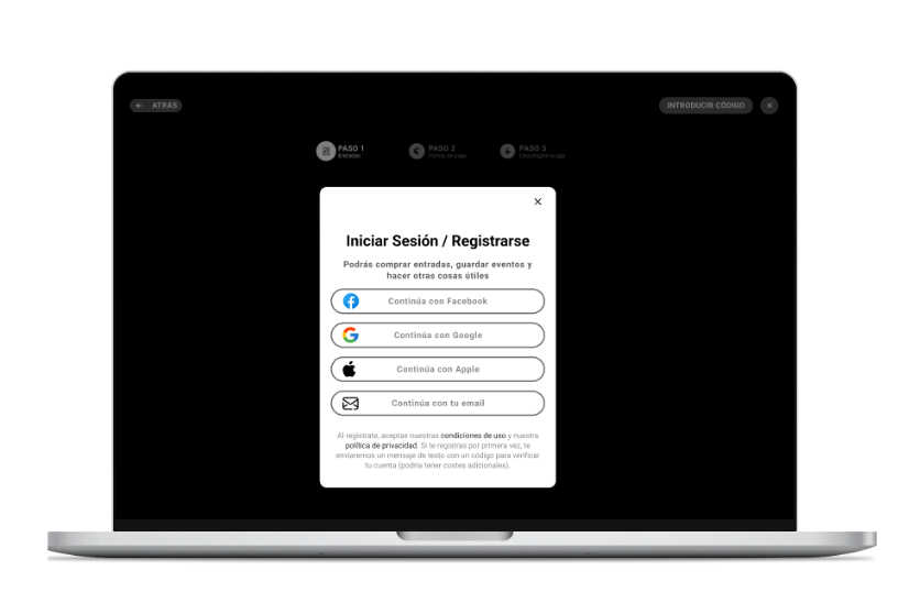
✅ Swifter registration and access: instant account creation or login through Apple, Google or social media sign-in options.
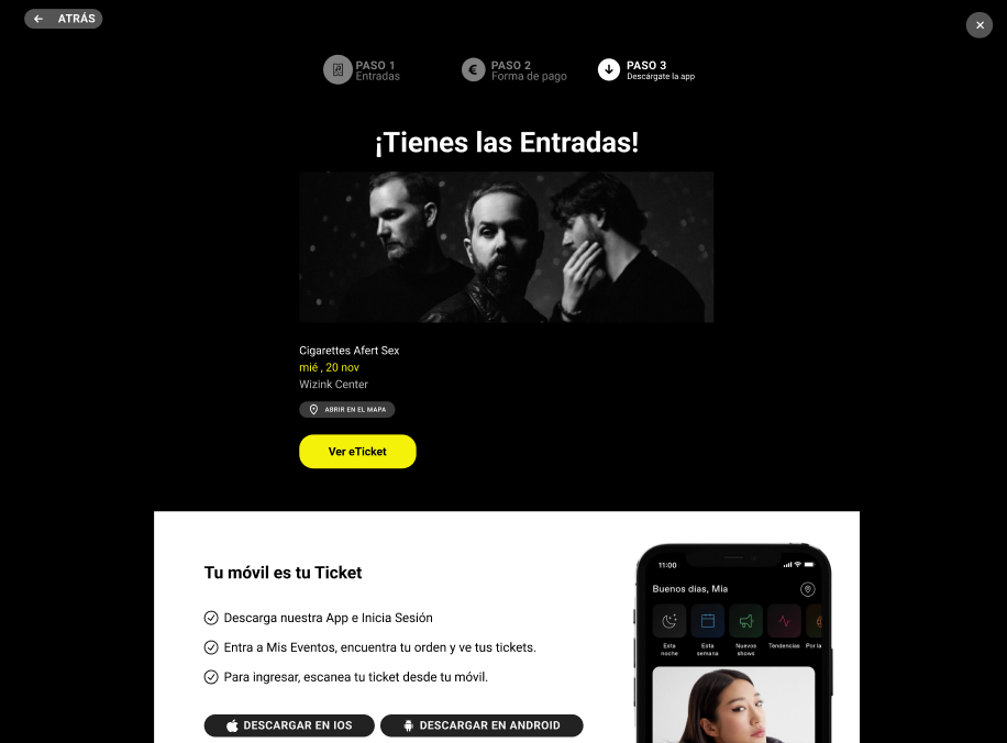
✅ Streamlined checkout process: eliminated redundant steps that create unnecessary loading times or decision fatigue ticket acquisition flow.
✅ Frictionless checkout: No need for the SMS verification codes during purchase finalisation.
✅ Users can choose how they will save the tickets: Directly download PDF tickets upon payment confirmation which bypasses app dependency for one-time attendees. Securely store tickets in-app, which adds an additional layer of security for the users that pay special attention to this aspect.
Final Note: The results of the proposed UI design solutions were not tested, as this case study project was conducted in a study group.
Related projects
User Research Project